When I was reading book How the Web was Born (which describes the history of networking, user interfaces, hypertext and other computing concepts which the world wide web is based on), I realized how different the first web browser as designed by Tim Berners-Lee was compared to both browsers which came right after it as well as to modern ones we are all using nowadays. In this post I will focus on development and use cases of early web browsers explaining why they differ so much both between each other and modern browsers highlighting connections between the original vision and current reality.
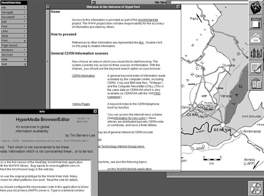
Until I red the book, I had only very limited idea how the first browser created in 1990 actually worked. I knew that the browser was implemented on a NeXT computer and I was familiar with it’s interface from few screenshots like the one shown below. Moreover as a former Window Maker user, I had some basic understanding of the nature of NeXTSTEP GUI. But I have never tried to look deeper than that before.

So when I started to read about it in the book, I quickly realized that the original design and it’s role in the history of the web is quite interesting, and it prompted me to look up more details later.
Looking at the original design
Unlike the modern browsers, the WorldWideWeb (as it
was called back then) was both a reader and an editor. It was
meant to allow users to create web pages as easily as they were able to read
them. To achieve this, Tim Berners-Lee build it’s graphical
interface on top of NeXTSTEP text processor GUI component, so that one can
easily edit anything on any web page in WYSIWYG fashion.
So from implementation perspective, this browser was web page editor also
optimized for sheer reading. Changes in local files could be directly saved,
while for remote pages served
over http or ftp, you could at least save your changes into a local copy
instead. Remote editing was not an option since there was no support for it in
the protocol. HTTP PUT
method was
proposed and then standardized much later.
The NeXTSTEP platform, especially it’s object oriented nature and Interface Builder, was crucial for this design to be implemented quickly, as Tim Berners-Lee explains:
There was an application builder to make all the menus as quickly as you could dream them up. There were all the software parts to make a wysiwyg (what you see is what you get - in other words direct manipulation of text on screen as on the printed - or browsed page) word processor. I just had to add hypertext, (by subclassing the Text object).
Looking at the screenshot above, you are likely wondering how would one edit a page? When one clicked anywhere within a web page, a cursor was inserted there and then one was able to start typing new text, remove existing text or navigate within the text. One can also select block of text using mouse and perform some action on it, such as simple deletion, creating a link or further formatting. These editing functions were available via a menu.

For further context, see a video demonstration of editing and linking from CERN 2019 WorldWideWeb Rebuild project, which provides javascript reimplementation of the first browser UX along with explanations of it’s features, so that you can also try it yourself. I used it to record the editing demonstration above. That said if you are using Firefox note that it’s unfortunately optimized for Blink based browsers such as Chrome, and some features like editing work only in such browsers.
This editor/reader design influenced other parts of the browser as well. For example there was no bookmarking feature. However that wasn’t because Tim Berners-Lee didn’t anticipate users to collect and manage links to other web pages. Users were expected to maintain links for future reference on their own local web pages instead. This is also where the original concept of home page comes from. The home page was as it is now the first page shown when the browser starts, but unlike today, one could create and edit it’s own home page directly in the browser easily.
Another interesting detail is that when you double clicked on a link (single click was used for editing as we noted above), new window with the target page was opened. You leave a page only when you explicitly closed it’s window. It was not possible to open a different page in existing window.
It was also not possible to include images directly into a web page. Instead images were referenced via links as any other documents, so when one opened such link, the image was shown in a new window. This allowed a reader to inspect the image while still reading the original page, possibly scrolling down without the image to disappear with the text. The img element was introduced later in 1993.
Surprisingly there was no URL bar. To open particular web page using it’s URL, one would use Open from full document reference dialog instead. This design is similar to how word processors such as LibreOffice Writer work: there is no file path bar either, but but one can go to open file dialog and select or type path of a file.
And last but not least when I played with the 2019 UX rebuild, I noticed that it was not possible to change width of a page window. This seems to be yet another behaviour which was likely based on a word processor interface. That said here I’m not 100% sure as I was unable to find any explicit reference to this.
(Un)expected familiarity
The idea that people will be creating their own web pages directly in the browser to keep track of their projects and to collaborate with others failed to materialize as originally envisaged. That said a similar outcome was later achieved in a different way via various web based content management systems, which are build on top of the open web standards rather than being direct part of it. This difference may feel subtle, but it has major consequences, both good and bad.
When I tried the javascript reimplementation of WordWideWeb and learned it’s editing functionality a bit, it sometimes felt like a bare-bones version of Google docs and vice versa editing a Google docs document using only core features reminded me a bit of the WorldWideWeb UX. I wonder how many people using modern cloud document collaboration platforms would be surprised to learn that some core parts of this use case were covered in the original vision for the web. That said I personally I find Google docs too paper like and I don’t like the fact that it tries to keep you confined in it’s closed ecosystem.
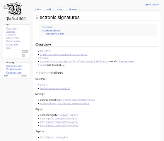
I also realized that my local personal wiki workflow is somewhat close to the original concept of user maintained local pages (ignoring the fact that my wiki doesn’t have WYSIWYG editing mode). This wiki is set as my home page, so that I’m able to easily edit or create new pages. So for example for some areas of interest, I maintain a wikipage with list of links and some additional notes, rather than using browser provided bookmarks.

Moreover concept of user created homepage is not entirely lost, even though maintenance cost and purpose of start pages presented in r/startpages subreddit is different.
I also like the concept of opening images in a separate window, so that I can continue reading a page while still being able to inspect an image. This approach is unfortunately not popular nor easily available for some reason. Both Firefox and Chromium allows to easily open given image in new tab, but not in a new window, which is available only for links. Even worse is that some web platforms provide images via javascript image galleries, which can’t be easily opened in a new window. On the other hand, similar feature for videos under name Picture-in-Picture was introduced some time ago, so I wonder why not to have something similar for images as well.
And last but not least it’s interesting that something so fundamental as URL bar that proposals to remove or simplify it creates lot of backlash was not even present in the original design. That said one is not expected to narrow down every detail in a first prototype.
Kickstarting the idea
While the NeXT computer platform was crucial for quick development of the first web browser/editor prototype, the platform also had a significant downside in small user base. Even at CERN during the early stage of the web project, WorldWideWeb had 2 actual users only: Tim Berners-Lee and Robert Cailliau, who were also the only people working on the web fulltime back then. But for the web to succeed, it was necessary to have a client software available on all major platforms, including PC (MS DOS/Windows), Mac and Unix X window. Sheer porting WorldWideWeb to other platforms was out of question.
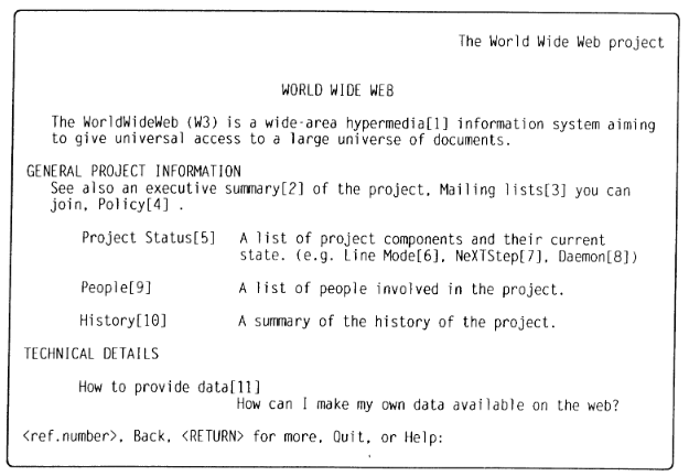
For this reason, the next web client software, implemented in 1991 by Nicola Pellow during her internship at CERN and named Line Mode Browser, provided a simple read only text interface so that it could be compiled and used on almost any platform including “dumb terminals” (it didn’t even use curses library, unlike text browsers I’m familiar with today). To navigate links with keyboard only input, each link had displayed a unique number next to it and one had to type this number down to proceed to it’s target page. Compared to the first browser/editor it was very limited, but it was the first browser most people could actually use on computers they had access to.

But having nice simple browser compatible with almost every computer platform would not drive adoption of the web nor help CERN with information management problem if there were no useful information available there. Understanding this opportunity Bernd Pollermann created so called XFIND Gateway which provided information from CERN XFIND information system via web. This may not sound like much, but it was actually extremely useful for physicists using various CERN information systems. The book gives an example of a physicist from German particle physics lab DESY who get used to look up information via XFIND at CERN, but using it from DESY was bit clumsy. First of all he had to telnet to CERN, then login to IBM CERNVM machine, then start XFIND there and then finally place his query to XFIND. Moreover as the connection was slow an unstable, one have to repeat this procedure again in case of a network failure. Compared to this using Line Mode Browser from DESY to directly access XFIND Gateway at CERN was a big improvement, which helped the web to spread to DESY.
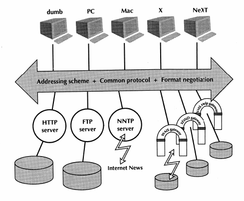
The following diagram shows overview of the web ecosystem in 1992, but note that during early stages of the web (in the end of 1990), WorldWideWeb browser/editor (NeXT), Line mode browser (dumb) and FIND gateway were already in demonstrable state. Then during following year 1991 first version of Line mode browser was released and another web gateways were deployed for VMS/HELP and WAIS information systems. This means that most of the information available on the web were provided via these gateways from other systems in an uniform way. Moreover this unification was another important selling point of the web.

So we already see that there was a big difference in functionality and use cases between the original WorldWideWeb browser/editor prototype and first actually widely used Line Mode Browser. The latter was missing lot of features from the former, but even in this limited text based read-only form it was already very useful.
From the diagram above it’s obvious that the plan was to eventually create more powerful web client for each platform. And even though in 1992 Robert Cailliau and Nicola Pellow started working on MacWWW (aka Samba) which was a simple browser for Macintosh computers, Tim quickly realized that CERN won’t give them enough resources to implement nor maintain browsers for all the platforms. So instead he decided to focus on libwww library covering core functionality of a web browser, which can be used by others outside CERN to build their own browsers on different platforms. This resulted in wave of new browsers released in 1992 such as Erwise, ViolaWWW, MidasWWW or Lynx. With exception of Erwise, which was a short lived student project, authors of these early browsers used libwww to add web viewing functionality into established software projects. This also meant that each of these browsers provided some unique features. Later on in 1993 NCSA released Mosaic browser, which was a proprietary graphical browser build on top of libww. Mosaic quickly become the most popular browser until Netscape Navigator took over it in 1995.
Here it’s worth noting that libwww (along with the server and line mode browser code) was released in public domain, even though that Tim originally considered GPL. That is because he was more interested in kickstarting the idea of open web as a protocol and open standard rather than particular server or client software implementation.
Conclusion
Overall I find it impressive how Tim Berners-Lee, Robert Cailliau and other early web people were able to combine both crazy moonshot ideas with pragmatism and execution, which combined together made the project successful.
Now I also better understand motivation behind various web editing features
standardized over the years, such as PUT or DELETE methods or
WebDAV extensions. Both of these
standards are nowadays commonly used in web APIs (REST, CalDAV, …) but almost
nobody uses them to edit resources as originaly envisaged. And while
I understand that Tim regrets that his original vision didn’t fully take off,
I’m not really sure he could have done a better job to promote it without
sacrificing decisive growth of the web in the early stage of the
project since as we have seen, collaborative editing was not a driving force
behind the early web adoption.
References
Main sources I used to write this post, which are worth checking if you find it interesting:
- Book How the Web was Born: The Story of the World Wide Web by James Gillies and Robert Cailliau
- Description of The WorldWideWeb browser by Tim Berners-Lee
- Article about The Nexus Browser, including a nice video demonstration
- CERN 2019 WorldWideWeb Rebuild project provides javascript reimplementation of the first browser UX, along with explanation of it’s features and historical context
- Earliest Web Screenshots and description of Line Mode Browser
- Line Mode Browser 2013 simulator, unlike The WorldWideWeb simulator, this one is no longer up and running
- Presentation Introduction to the World-Wide Web from 1994, including demo of early web, by Robert Cailliau (the browser used during the talk is Mosaic)
Additional references:
- Article WorldWideWeb from Wikipedia
- Original announcement WorldWideWeb: Summary from Tim Berners-Lee explaining the web project, see also 30th anniversary of a public announcement of World Wide Web project
- List of some of those who have contributed to the WWW project
- A Little History of the World Wide Web
- Licensing the Web
- History of Web Browser Engines from 1990 until today
- Web Editing APIs